Ival Water e-commerce
website audit & redesign
Time Line:
March – May 2025 – 6 weeks
Overview:
Ival Water is one of the leading water brands in the bottled water sector in KSA.
Website UX audit and redesign project focusing on modernizing Ival Water Company’s online presence and improving usability and website structure.
My Role – Senior UI/UX Designer:
UX Audit (conducted a full usability and heuristic evaluation), User & Competitive Research (analyzed user behavior, competitor websites, and best practices), Information Architecture, Journey Mapping & Wireframing, Usability Validation (prepared and conducted pre-tests and usability sessions).
Key Insights:
1. UX without business analytics is half the picture.
The high bounce rate was explained not by the design, but by the logic of the cart, which was cleared without warning.
2. Business metrics are indicators of UX problems.
The drop in conversion is a consequence of the complexity of ordering – after the checkout redesign, this indicator increased.
3. UX research helps to identify invisible points of business growth. The result is the creation of an automatic ordering function, which in the long run increases retention.
I saw that the true value of UX is not only in creating a convenient interface, but in the ability to find where exactly the user experience can affect profit, trust, and customer retention.
...not only to order water,
but to trust, engage, and stay
Problems
Goals
The Ival Water website showed low engagement and poor conversion performance. Users struggled with navigation and checkout, leading to high cart abandonment and low repeat purchase rates.
These issues resulted in a poor user journey, reduced trust, and limited business growth potential. The UX audit was initiated to uncover the underlying causes, improve usability and conversion, and redesign the experience to reflect the quality and reliability of the Ival brand.
Based on analysis and business needs, the findings include:
1. Low conversion rate and high cart abandonment (≈65%)indicated that users struggled to complete purchases.
2. High bounce rate (≈55%) and short average session duration (under 1 minute) suggested that visitors couldn’t find relevant information or were unsure about product quality and brand trustworthiness.
3. Limited retention and repeat purchase rate (under 20%) reflected the absence of loyalty programs, subscription models, or incentives for reordering.
4. Frequent customer support requests via phone – users couldn’t track orders, schedule deliveries, or contact support easily online.
Business goals:
The main objective was to increase online sales by improving the overall e-commerce experience. Also, the company aimed to expand its market reach. Additionally, to strengthen brand trust through transparency.
User goals:
Users want to easily find and purchase bottled water through a simple and fast checkout process. They expect to choose convenient delivery options with transparent pricing and access to support quickly
Our goal:
The design goal was to ensure a smooth and intuitive user journey. The focus was on reducing friction in the buying process by simplifying interactions and optimizing usability. Additionally, the redesign aimed to create a clean, modern, and visually appealing interface
Behind the redesign:
the process that transformed website
Defining
Website Analysis
Target Audience Analysis
Competitor Analysis
UX Audit Report
Website Redesign
Why was it used:
To align business goals and prioritize functions that directly impact revenue and experience.
What we got:
1. A clear understanding was achieved regarding “What do we want to improve?” and what specific results are expected at the end.
2. Goals, timelines, and budgets were discussed and agreed upon, along with communication protocols with client representatives.
Website Analytics Evaluation
Why was it used:
To identify behavioral patterns, and detect key pain points that impact conversions and engagement. This analysis helps validate UX audit findings with real user data.
Insights:
- 1. High Drop-Off During Checkout – many users abandoned their carts (too many steps, unclear buttons, or limited payment options).
2. Users spending little time on informational sections, suggesting that the brand’s uniqueness and quality proof weren’t effectively communicated.
3. Users clicking on non-interactive elements (like banners), indicating unclear affordances and inconsistent structure.
Heuristic and UX Standards Evaluation
Why was it used:
To ensure the website meets established principles of usability and user-centered design, to identify hidden usability gaps, improve accessibility, and align the product with industry best practices.
Activities:
1. Conducted UX audit of all key website functionalities and user flows.
2. Reviewed the main website pages (Home, Product, Category, Cart & Checkout, and User Profile)
3. Evaluated information architecture and navigation
4. Audited forms, buttons, and interactive elements for clarity, accessibility, and ease of use.
5. Reviewed visual consistency and style to confirm alignment with the brand identity.
6. Research results have been formalized in the report and recommendations for their improvement have been provided.
Insights:
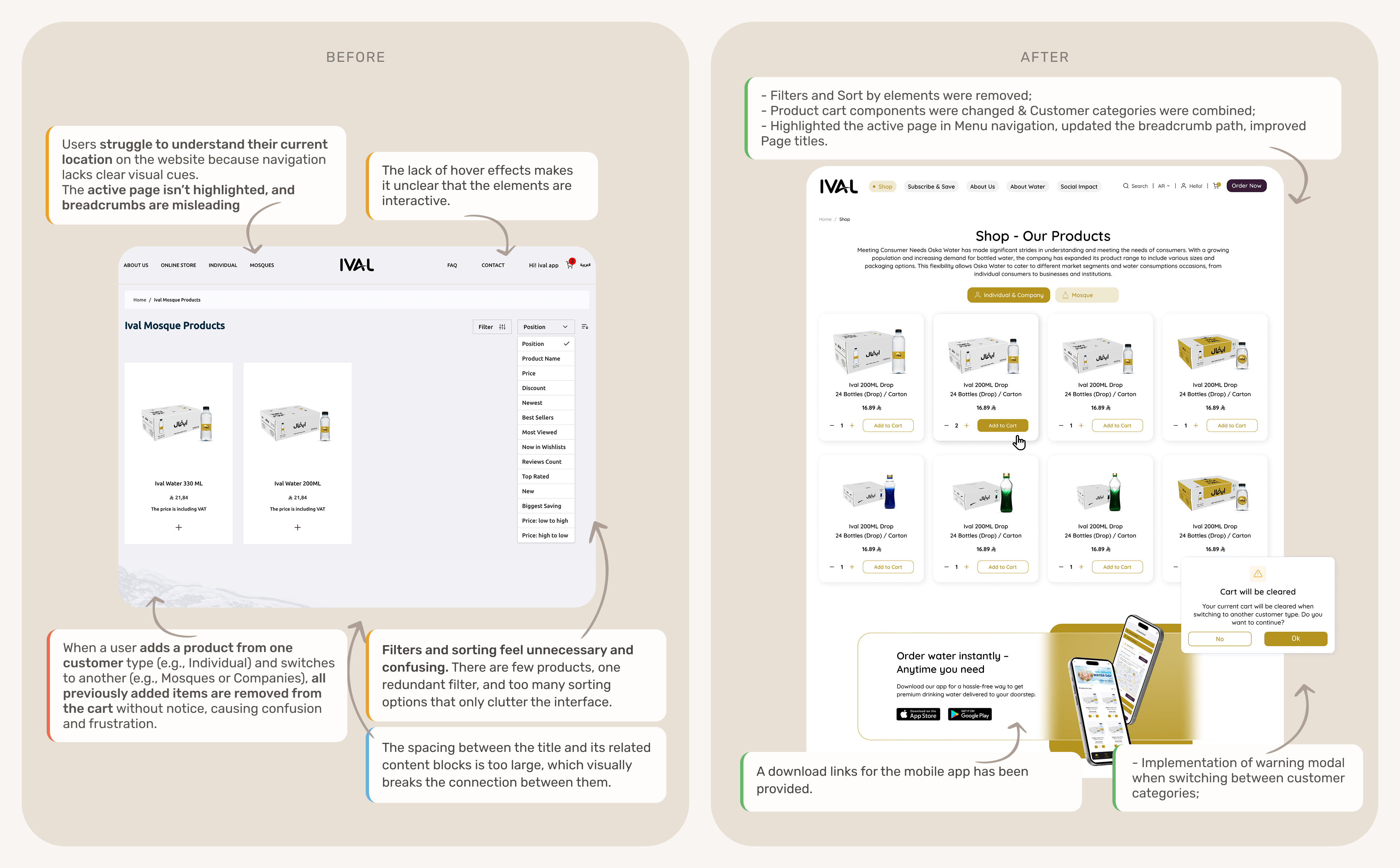
- 1. Navigation & Orientation Issues. Users have difficulty understanding their location within the website due to unclear page highlighting, misleading breadcrumb paths, and lack of clear separation between Home and Online Store;
2. Checkout process. When users add products from a new category (Individual, Company, Mosque), the system removes previous items without warning, causing confusion and frustration. Users may think the website has errors or that products disappeared on their own.
3. Interaction Feedback Gaps. Many interactive elements lack hover states or clear click indicators.
4. Content & Layout Problems. Oversized product cards, excessive white space, and unclear block purposes reduce usability and visual connection.
5. Unnecessary Elements. Some filters, categories, and blocks provide little value or duplicate information, creating confusion.
User Interviews
Why was it used:
Gain a deep understanding of motivations, pains, and contexts (family visits, searching for discounts, fear of losing a car). Test assumptions with real stories.
Process:
When carrying out this activity, the method — Interviews were used. During the research period, 12 real users of the website were involved in a 20-minute Zoom interview.
Insights:
1. 80% Users don’t like to waste time reordering the same products and forget about them;
2. 60% Users lack trust and clarity, as all water brands seem the same, and key information about product quality is missing;
3. 40% Users mentioned about inconvenience of payment and saving payment details; they prefer fast payment methods;
4. 50% Users are not motivated to reorder, they don’t have any benefits or loyalty system;
5. 80% Users cannot schedule delivery or track the order status;
6. ~40% Users find it difficult to contact customer support when they need help quickly.
7. Insufficient visibility of promotions and special offers.
8. Lack of quick access to favorite products.
User Personas
Why was it used:
Creating user personas allowed us to humanize our data and design decisions — focusing on real people instead of abstract metrics. It helped us align business goals with users’ actual needs and prioritize features that bring the most value.
Insights:
1. Users avoid reordering because it feels time-consuming and repetitive.
2. We believed users focus mainly on price — yet they value trust, product quality, and clear information about water safety even more.
3. Сontrol over delivery time and tracking turned out to be one of the strongest decision drivers for both personas.
4. B2B clients also want bonus systems or discounts as a form of recognition for regular large orders.
Why it was used:
To collect benchmarks on navigation, offers, indoor maps, and loyalty and not invent obvious patterns.
Result:
Several competitor applications in the client’s region were selected and their functions were analyzed. Based on this consideration, 20 primary and 8 secondary functions were formed.
We paid special attention to the following list of functionality that can be added to Mallers application:
1. Registration: Include the possibility of registration via Email and social networks;
2. Onboarding: Add onboarding for new users to help them quickly learn the app;
3. Search: Improve the search function by adding the ability to filter and sort;
4. Navigation: Provide maps and directions for better navigation inside the mall;
5. Offers: Highlight and nicely visualize the current discounts page;
6. Parking: Expand parking functionality by adding smart parking and the ability to reserve a parking space.
7. Gift Cards and Rewards: Emphasize rewards programs and the ability to purchase gift cards;
8. Services: Expand the range of services, including a personal stylist, where possible.
Visualization of Research Findings: Mallers Competitor Analysis
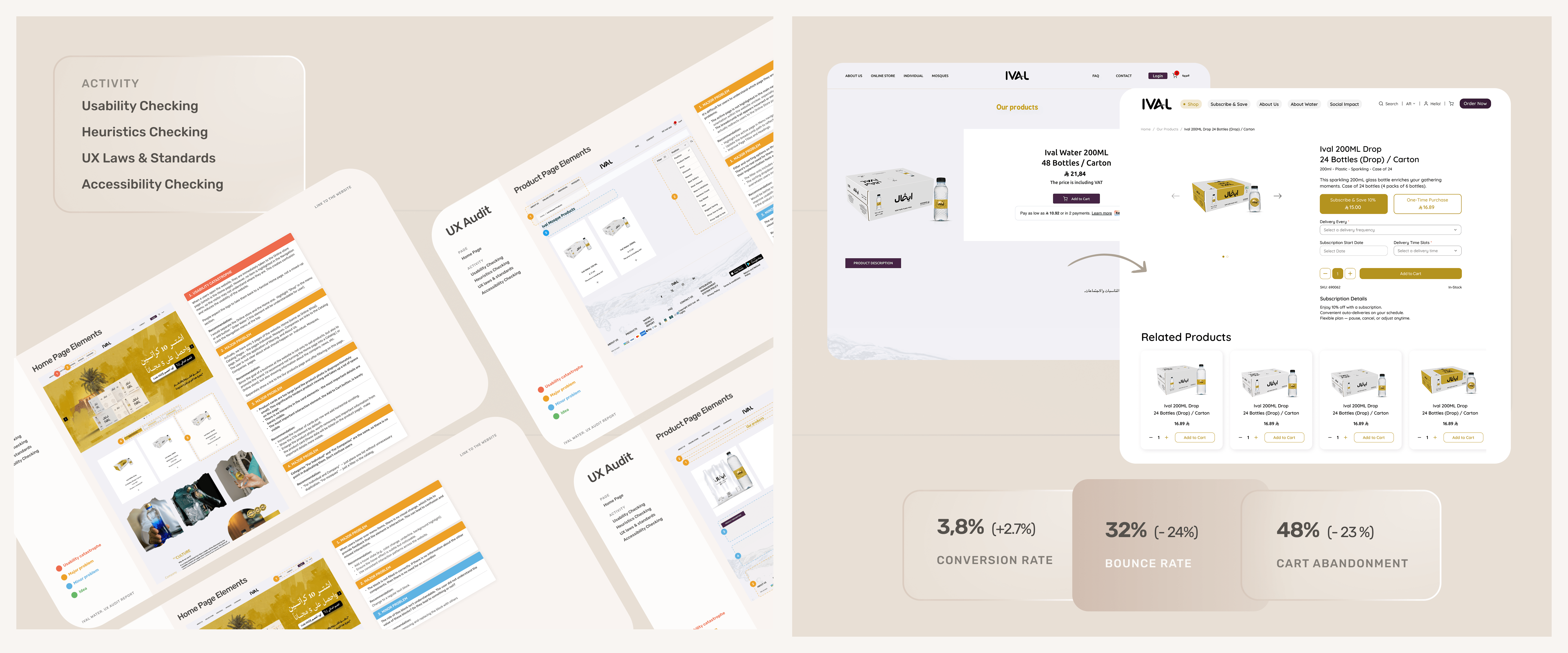
A UX audit was conducted to identify key usability issues, visual inconsistencies, and interaction barriers that were impacting user satisfaction and conversions.
What the audit included:
1. Website structure and navigation analysis – checking whether users can easily find the information they need.
2. Evaluation of key user scenarios, including checkout, account management processes.
3. Heuristic evaluation – checking the site against Nielsen’s 10 heuristics and core UX principles.
4. Checking the website’s compliance with globally accepted accessibility standards for websites and applications WCAG.
5. Checking visual consistency (typography, colors, alignment, and interface components).
6. Analytics analysis – Google Analytics and Hotjar data (bounce rate, heat maps, user paths).
Based on the insights obtained, priority areas for redesign were identified.
How Might We: Turning Problems into Opportunities
Hypotheses + RICE Prioritization
Information Architecture
User Flow
Pre-Test Scenarios
Prototyping
List of functionalities that
have beenimplemented
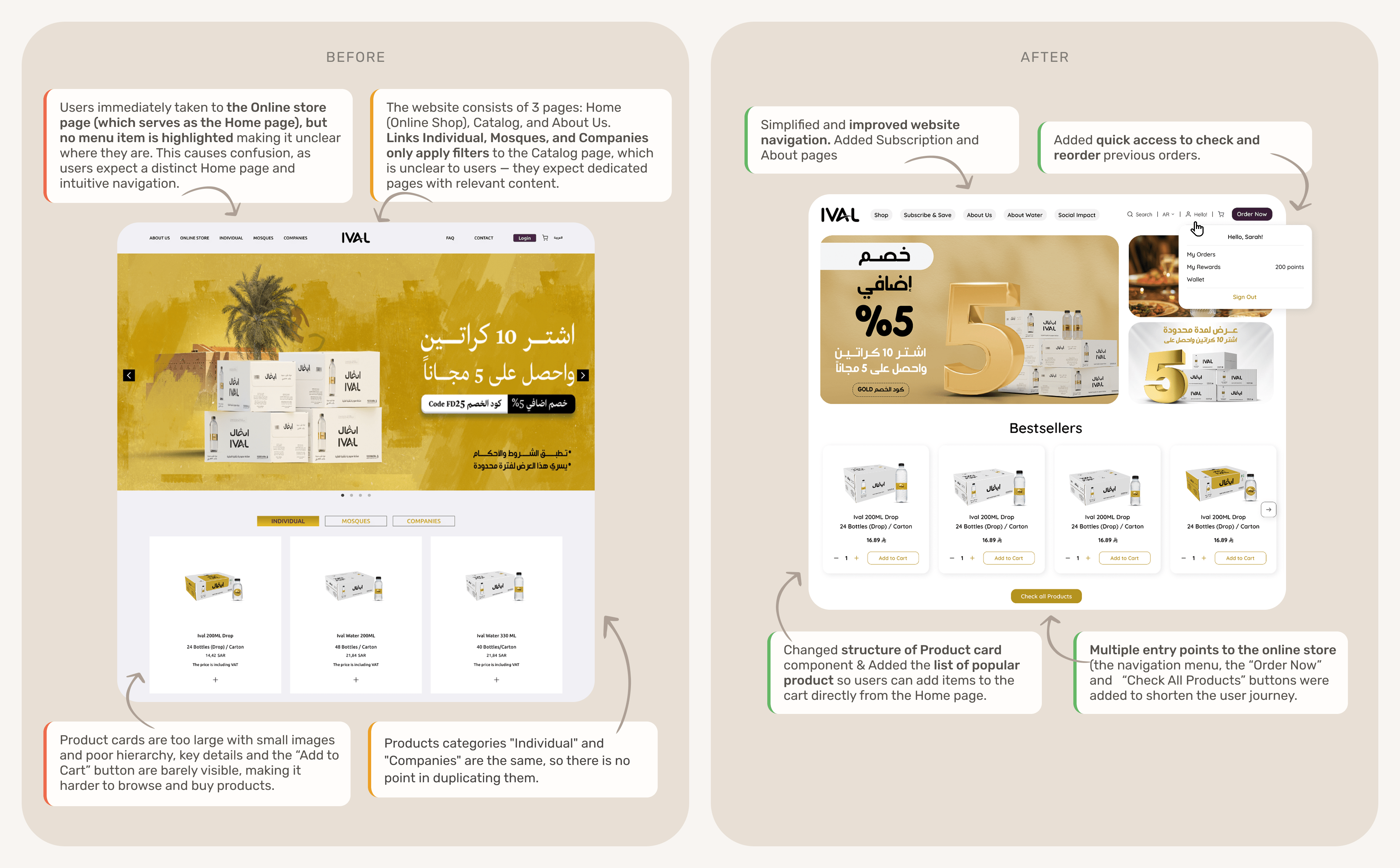
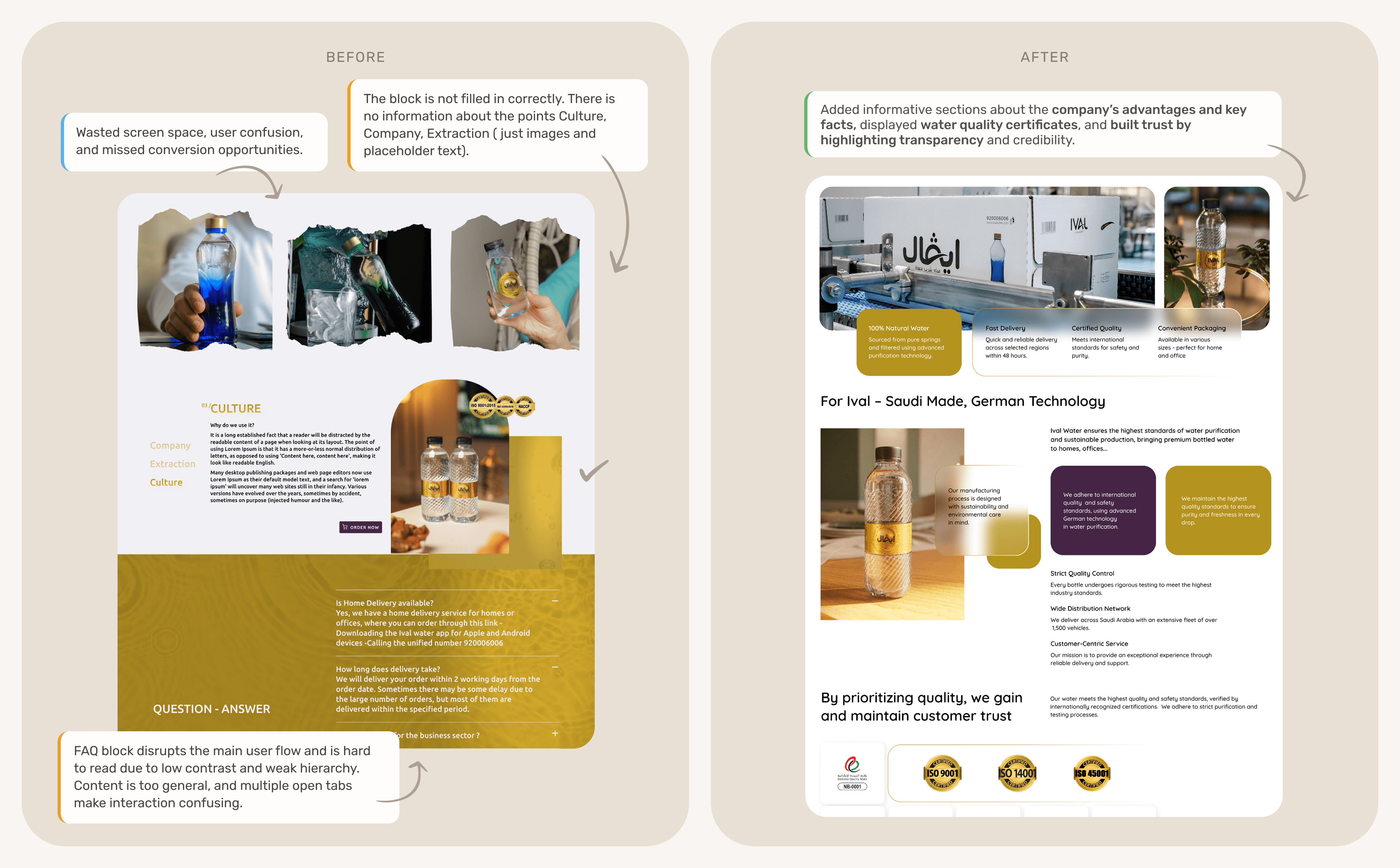
01. Home Page Changes
In order to improve user interaction with the website at this stage, the following changes were made:
1. Simplified website structure and improved navigation clarity, added info about the company and water quality;
2. Replaced one large banner with three smaller ones to highlight more offers;
3. Introduced quick access to previous orders for easy reordering;
4. Added a Loyalty Program section showing available reward points;
5. Integrated a new payment method, Wallet, with instant access;
6. Added multiple entry points to the online store (“Order Now”, “Check All Products”, menu link);
7. Changed the structure of the Product card component & added the list of popular products;
8. Added blocks about company advantages, key facts, and water quality certificates to build trust.
02. Category Page Changes
In order to improve user interaction with the website at this stage, the following changes were made:
1. Filters and Sort by elements were removed;
2. Product cart components were changed & Customer categories were combined;
3. Highlighted the active page in Menu navigation, updated the breadcrumb path, improved Page titles;
4. A warning modal when switching between customer categories was implemented.
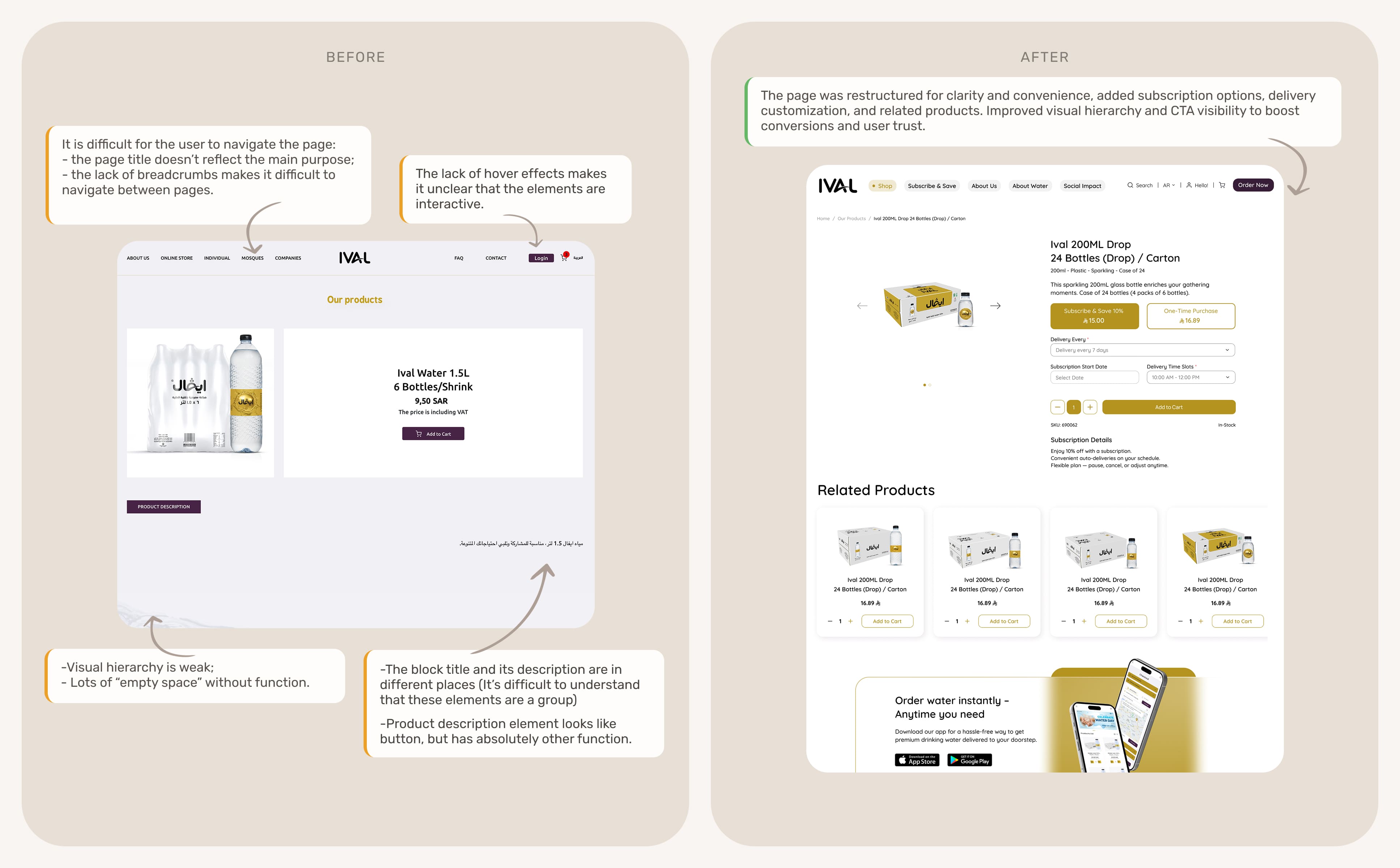
03. Product Page Changes
The page was restructured for clarity and convenience, added subscription options, delivery customization, and related products. Improved visual hierarchy and CTA visibility to boost conversions and user trust.
03.
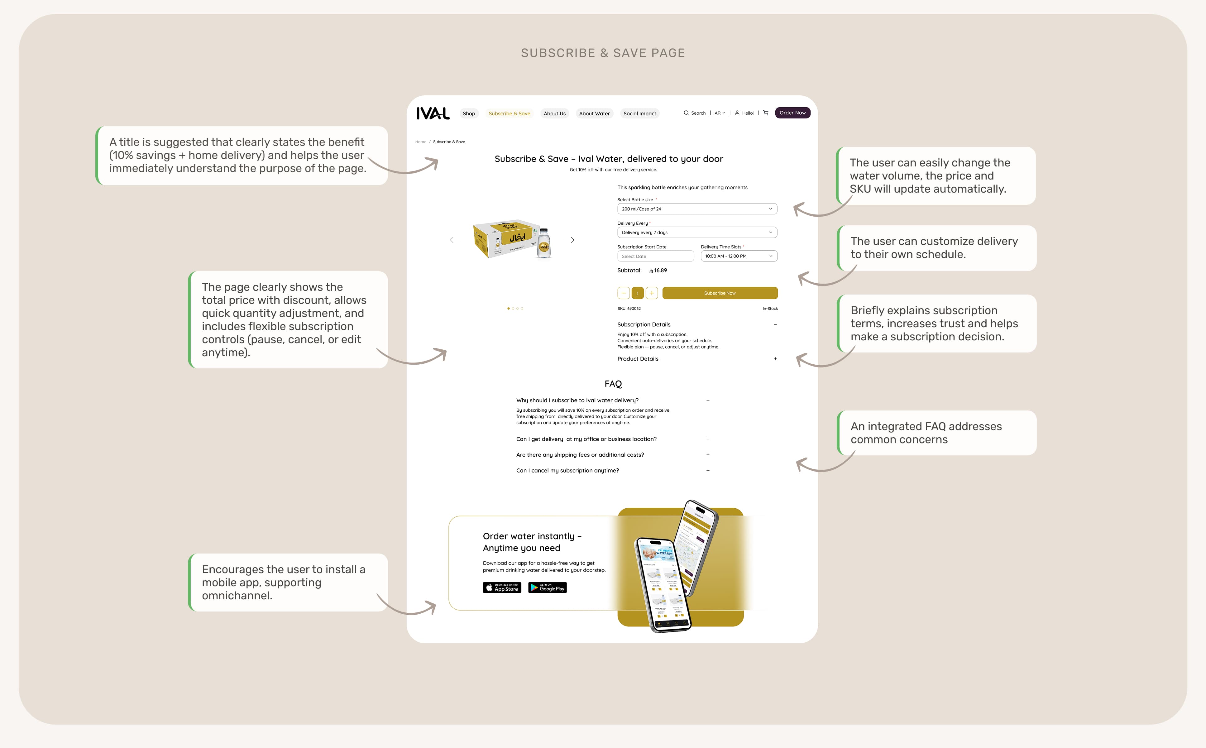
Navigate. Problem #1:
“Don't want waste time re-ordering the same orders”
One of the key user pain points was the desire to automate routine tasks, people don’t want to waste time repeatedly placing the same order.
That’s why we introduced a subscription option for regular deliveries and a one-click repeat order feature, allowing users to save time and enjoy a seamless experience.
04.
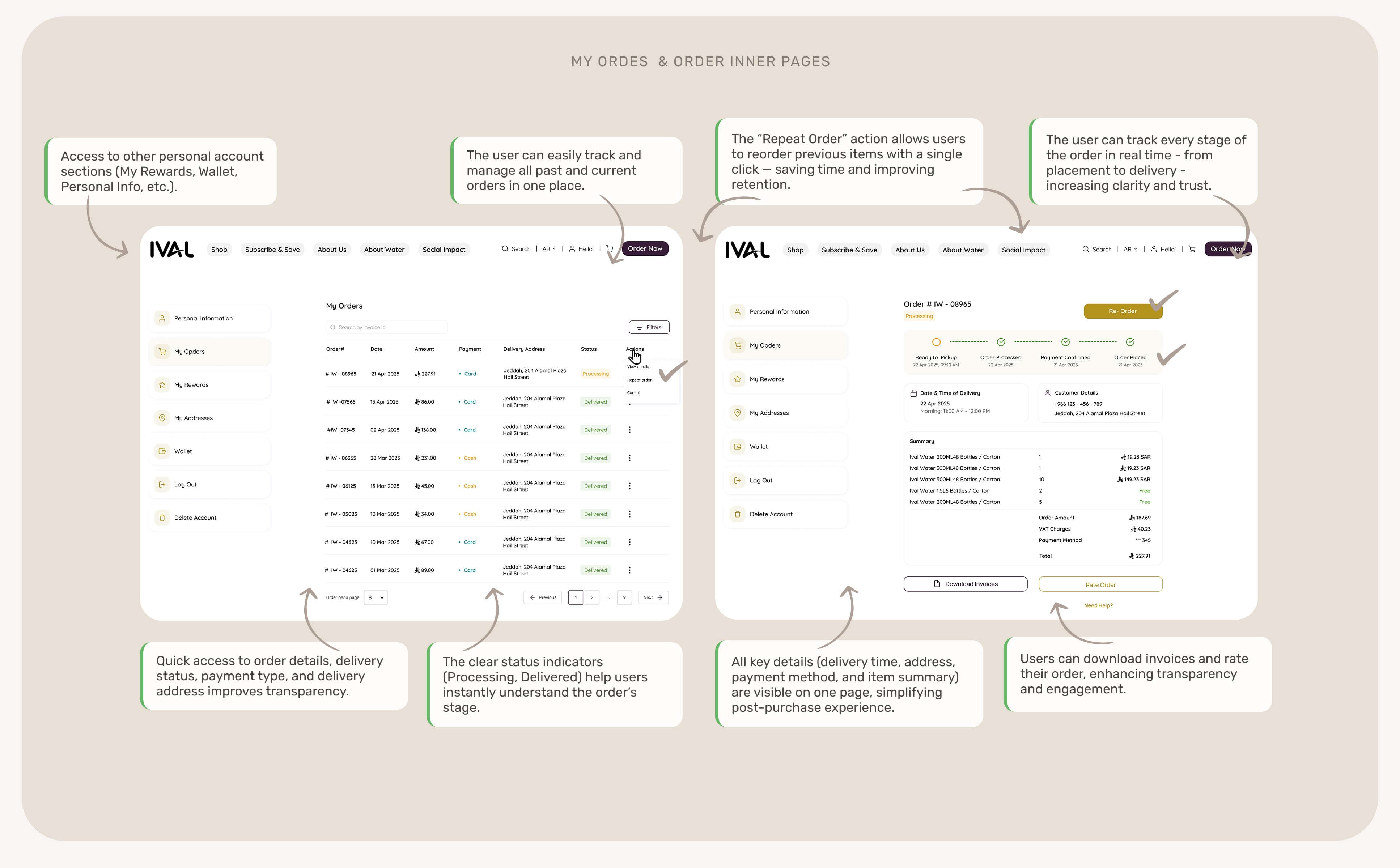
Explore Problem #2:
“I can't track my order status in real time”
Users reported that they couldn’t track their order status in real time and felt uncertain about delivery progress.
To address this, we introduced a new Order Management System within the user’s personal account.
Now, customers can:
– Track their order status in real time through a clear progress tracker;
– View full order details – delivery time, payment method, and summary – all in one place;
– Reorder previously purchased items with a single click;
– Download invoices or rate their order, improving engagement and feedback.
This functionality significantly improved post-purchase experience, increased user confidence, and reduced support inquiries related to order status or delivery.
The true value of UX is not just in creating a user-friendly interface,
but in the ability to find where it can impact revenue..
Business results:
– Improved conversions with a simplified structure, clear navigation, and new checkout scenarios;
– Reduced bounces and abandoned carts with a streamlined checkout process;
– Increased customer loyalty with subscriptions, reorders, and a wallet;
– Increased brand trust.
User results:
– Users received a transparent ordering and tracking process;
– Subscription and reordering removed the need to spend time on routine actions;
– Mobile adaptability and clear navigation made purchasing water simple from any device;
– Additional motivational elements (loyalty program, bonuses).
What I learned:
1. While working on the project, I gained valuable experience in combining a research approach and business analytics;
2. UX without business analytics is half the picture.
The high bounce rate was explained not by the design, but by the logic of the cart, which was cleared without warning;
3. I was convinced once again that UX without business analytics is half the picture. For example, the drop in conversion is a consequence of the complexity of ordering;